Arms of Subjugation: Asset Pack
Setting the Art Direction
Setting the Style Early
- BrushingBlooms
This is an art and style development log. I do not have a background in programing thus this info will only pertain to the artistic choices of the Arms of Subjugation. This is the way I've found easiest to approach asset creation to create a cohesive "style" where everything looks like it belongs together.
The theme for the Pirate Software 16 Jam was "You are the Weapon" and we chose to go with the literal interpretation of the PC being a weapon that posses people. We had a hunger to sink our teeth into a roguelite fighting game and quickly we were theorizing on possession type mechanics.
A limiting factor that we discussed early was using the npc's "blood" as a health bar, so bloodied enemies could be easier to posses but have less health and full health enemies would be harder to take over. There was lots of conversation around using blood as a mechanic as well as demons or pacts with deities.
So early on our themes were: Possession, Blood, Demonic Pacts
These are rather dark themes with very heavy implications that I didn't think we could tackle effectively in 2 weeks. So in order to keep the game from going too macabre the art had to be lighter and more whimsical. Thankfully the developers felt similarly as we shared Inspiration pictures to narrow down "The Look"
The developers game layout inspiration:
| 
|
| 
|
My art style inspiration pics:
| 
|
| 
|
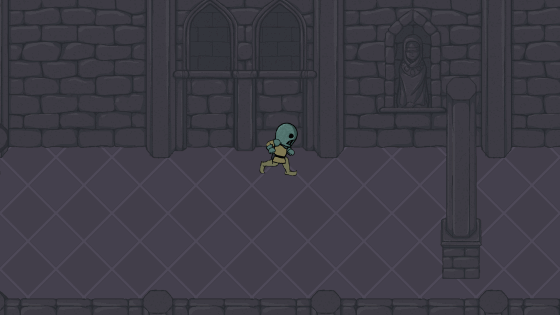
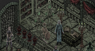
With this visual catalog I had a base to bring together a style idea. The goal being to keep and respect the darker elements of the game without making it feel too heavy by using more cartoony assets. This was the first iteration at a concept screenshot for the game
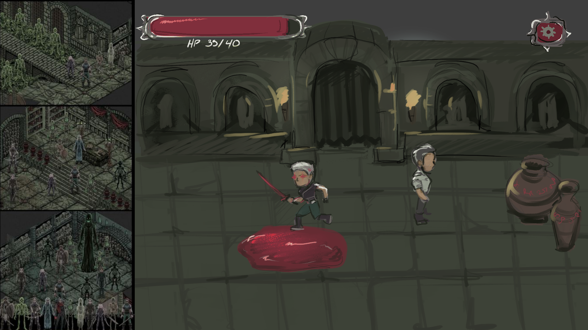
As you can see I pulled colors directly from a virtual tabletop asset pack by u/malistroi from reddit. The muddy dark color scheme reeled me in especially as our teams' conversations for game design revolved around dungeons and castle walls. I also drew upon the Castle Crashers art to create big headed characters that I knew could be easily segmented for animation rigging. The Last Faith was in there mostly for vibes and architecture inspiration which did not make it into this first concept screen and Radiata Stories was being reserved for a more serious stab at character design.
This concept is super rough but we now had something on the board. After conversations and critique the team had an agreed upon direction on where we wanted to push the art/final look of the game.
Color Tweaking
Now a similar hue value scale for a ttrpg pack can work since the story is player driven and background details can be just as important as player characters. But for our fast paced fighting game I wanted to establish a visual hierarchy where the player could easily identify the important visuals such as enemies or props so I brightened up those colors to help pull them forward.
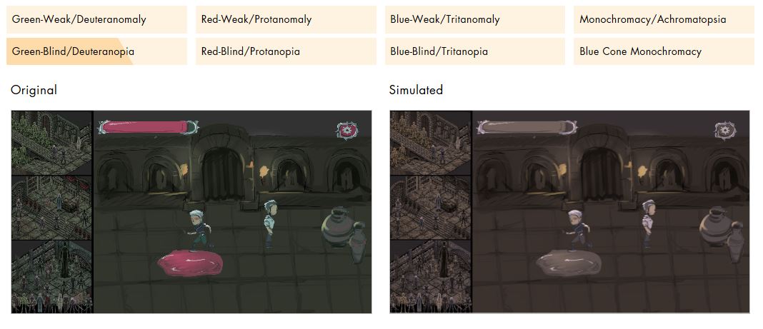
From here the color scheme when through a full round of adjustments; Using a muddy pallet meant our game would be harder for someone with colorblindness to play our game, especially since red/green colorblindness is the most common variation affecting about 1/12 men. Running the first concept art through a red/green filter produced this mess:

Without heavy use of linework our assets would get lost in the greys. Linework that I did not have the time to produce. So going back to the drawing board I started manipulating the color scheme.
Looking back these were minor changes that I should have pushed further. The goal was to make the characters and the blood stand out, so complimenting the red of the blood with green overtones seemed like a no brainer. By the time I got the color scheme nailed down I did end up pushing green to a more blue hue but for now I started with the color concept below:
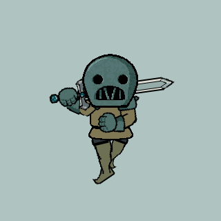
Pulling the colors from this new concept pallet I began the first round of character design:

We knew we wanted to have multiple character types that would behave in the same way. Animation rigging was a concept I had only attempted before but it was going to be the best process for us to get several different character animations out in the shortest period of time. Because of this our characters had to have a similar build to avoid having to change the rigging once it was all set up.
Based on feedback from the team we focused on making animations with designs 4, 1 and 3
From here we started our asset list:
| Animation/Character Model rigging | Setting Assets | Icons |
| Base Model Quick slash Big slash Block Dash Flinch Death/Falling Power Move(?) Boss Monster (Can be a larger base model in time crunch) Weapons: Sword (in tandem with Base) Quick slash Big slash Block Dash Power Move(?) | Castle Dungeon Flooring Walls --Plain --brick walls --Archway/doorways Set Pieces Pillars Chains | Health Bar Power gauge menu backgrounds |
By no means did we think this list was comprehensive but it was the jumping off point we needed to get started.
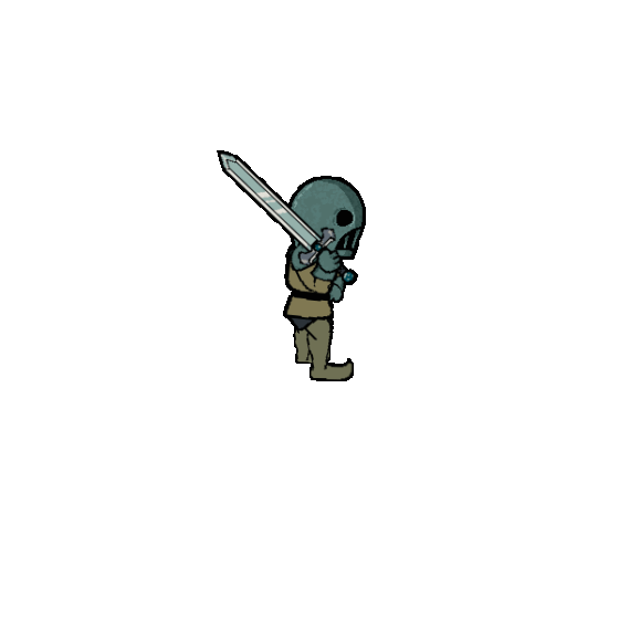
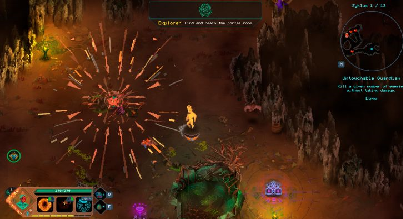
The fighting animations were going to be the core of my work for this jam. Even though I only had a rough color pallet and character designs there was a look to strive for which only matured as I move into the animation rigging. The rigging process itself will get it's own post as I ran into a lot of needless trail and error. But after finding the correct workflow setup I managed to produce 81 different finalized sprite sheets in a couple of nights.
I don't know how to end this but thank you for reading and please leave a comment if you found this helpful!
Leave a comment
Log in with itch.io to leave a comment.